


NRPLUS MEMBER ARTICLE P our, Tear, Carve: Material Possibilities is the new exhibition at the Phillips Collection in Washington, D.C. Using about 65 works from the permanent collection, it looks at how artists use unorthodox materials such as plastic, wood, scraps of paper, bones, dirt, glass, cloth, and sand to convey meaning. Art’s sometimes more than paint-on-canvas or ink-on-paper. “The medium’s the message” is Marshall McLuhan’s old saw. It means that the materials an artist uses aren’t neutral. They are part of the story, sometimes a nuance, sometimes a punch in the gut. Pour, Tear, Carve seemed promising to me, but it works in a haphazard way at best.
It’s what I call a shoehorn show. Some objects have a remote, even inscrutable link to the main theme of the exhibition. They’ve come from a recent donor, for instance, and they’ve got to be seen — or worn — whether or not they fit. Others are indeed poured, torn, or carved, but, as works of art, they’re not in the show because of quality or because they’re poured, torn, or carved with distinction. Rather, they’re on the walls because de rigueur PC thinking requires it, which means the subject’s hot but the art’s tepid.
The first gallery, Memories: Personal and Collective, makes the very valid point that different materials evoke different responses. In a tempera painting or, say, a painting by Jean-Léon Gérôme, surfaces are refined, or finished, to the point that the hand of the artist — brushstroke — disappears.
A painting by El Greco or Hals or Sargent — sometimes thickly painted with slashes and zigzags — generates both energy and a feeling of spontaneity.

Materials such as glass, bone, wood, leaves, dirt, and fabric are tactile and flip other switches in the brain. William Christenberry’s Southern Monument XI, from 1983, is an abstract sculpture that looks like a house set in a little plot of red soil from Christenberry’s hometown in Alabama. That soil — its color, texture, and its source — is visceral. It’s malleable. Christenberry said that, in making the object, he felt he could “reach out and touch memory.”
It works. I love Christenberry’s assemblages. The problem is that so much of the art is so-so or irrelevant or clumsily interpreted, and this mass of art, introducing the show, defines it. Yes, it’s good to see works from storage, and, yes, a permanent collection show isn’t expensive. Pour, Tear, Carve doesn’t have a scholarly catalogue, so skimping on rigor isn’t a mortal sin.
Still, Janet Taylor Pickett’s And She Was Born, from 2017, is big and bold, loud and proud, but very ordinary. I’m not a fan of Simone Leigh. She’s a brand, and her work’s sameful, and if I’ve just invented a word, it means “suffers from sameness.” Her No Face, Crown Heights is a terra-cotta and porcelain bust of a woman with no face. Leigh lived in Crown Heights in Brooklyn for many years. The subject’s faceless to suggest “a lineage of black women,” Leigh says, and “the labor, the care, the love, the ideals” they brought to their lives. What a warm and fuzzy yawn.
Alas, the medium — ceramic — isn’t the messenger. Ceramic’s not an unorthodox material, either. It’s sleek and stylish. It would look good in a Georgetown home but doesn’t convey “Crown Heights black women” without the long explanatory label.

Nekisha Durrett’s Eleanor Bumpurs Killed by Police on October 29, 1984 / Age 66, from 2020, is made from a dried magnolia leaf and velvet with “Eleanor” inscribed in gold letters. It’s senior-center craft-time work. Cachita, by the artist duo Los Carpinteros, is a big, coated-aluminum, wall-mounted cutout portrait with LED lighting. It’s part of a series of portraits of average citizens in Cuba who were young and idealistic when Castro took power in 1959 but who, in old age, have outlived the revolutionaries. Are they the heroes, out of mere endurance? I’d say yes, but the work has no depth beyond this.
Alfonso Ossorio’s Excelsior, from 1960, is very good. It depicts a young, nameless saint made from seashells, bones, fake glass eyes, marbles, rope, and a halftone photograph, and lives in a velvet-lined frame. Ossorio, born in the Philippines but a naturalized American, uses everyday materials to make the saint accessible and flashy. “The human being is the link between God and the material world,” he said, but like us mortals, the commonest things, though inanimate, are created by God to serve us, making them part of God’s mission.
The exhibition very quickly lands on “black lives lost to police violence” through art by Durrett and Desmond Beach. This is so predictable. I know, some of the staff might think math’s racist, but let’s noodle some numbers for the hell of it.
How many unarmed black men and women were killed by police in the line of duty in each of the last few years? Since 2015, the number’s 156, an average of 19 a year. These shootings don’t disappear from the news or the courts, as they often did until, say, the 1970s. They’re scrutinized, some sensationalized, and cops are punished — or not — via the criminal-justice system or internal police review.
Not to befuddle wee curatorial minds with big numbers, but there were some 300 million civilian encounters with local and state police each year. Some are bound to go very wrong.
In 2021 alone, 15,528 black people died in gun violence in America. In 2022, 9,941 black people died in gun violence. Most were men, and almost all the killers were black men. In Chicago alone last year, shooters killed 695 people, again, the commanding majority in black-on-black, gang violence.
Now, what’s the bigger number: 19 or 15,528? Head-scratching at the Phillips?
Think hard. Let the brain shine. What’s the bigger problem? What’s the unspeakable problem?
I like cops and don’t think they should be targeted in such a trite, glib way, and “black lives lost to police violence” is a cliché now. Somewhere out there, artists must be making work about real and terrible tragedy in cities, where so many young people, even children, die in random gang violence. It’s not my field, but the Phillips — all about diversity, inclusion, and equity — needs to find the art that treats the real world, not the art that coddles rich honky guilt, not to mention vanity.

Time Captured, the next section, might have been a better beginning since its big enchilada is The Round Table, by Georges Braque, from 1929. Braque invented collage, though this picture fits the theme of the exhibition because he mixed his oil paint with sand, gravel, and powdered quartz. He then incised the surface as if it were a sculpture or a print. Chaim Soutine’s The Pheasant, from 1926, is painted so thickly that the dead bird seems like a sculpture. It’s a scary, visceral image and should be. When Soutine was a child, his father locked him in a chicken coop for punishment.
There’s so much junk in the beginning of the exhibition. The curators seemed desperate to highlight black and Hispanic artists. For clarity’s sake, and to build a storyline, chronology seems the way to go. That would mean starting with Soutine and Braque. With them, even deep in the show, Pour, Tear, Carve seems to have found some footing. The topic of this gallery is unorthodox materials suggesting the ephemeral nature of life. A good Naum Gabo sculpture from 1948, made from nylon filament, conveys rhythm and movement. Jeanne Silverthorne’s Dandelion Clock, from 2012, is made from platinum silicone rubber and phosphorescent paint so it glows in the dark.
Dan Steinhilber’s Untitled (Mustard Bags), from 2003, is a wall tapestry of used mustard packets he collected from Washington restaurants. It’s fun but not very original. One of my favorite Addison exhibitions was called “Over and Over.” There, living artists working obsessively with unorthodox materials created the things on display. Tom Fruin, a very good artist, made a wall tapestry from used heroin bags he found on sidewalks in Holyoke, Mass. This show was years ago.
I hate mustard and ketchup packs because they always make a mess. Steinhilber said the mustard packs he used took 20 years to dry, making the passage of time part of the process.
The exhibition gets loosey-goosey in Places: Real and Imagined, which reflects on the idea of place not only as a physical destination but as an imaginary place traveled through the mind. There’s another Christenberry there. Kim Llerena’s Stonewall Jackson (Dismantled) Monument, from 2020, showing only the plinth for the Richmond equestrian statue, horse and Jackson having gone to the junkyard. It doesn’t belong in the show. It’s a straight photograph, and if that counts so does a Piranesi view of Roman ruins and a million other things. I don’t know why a Chagall’s there, either.
Places of Abstraction is also a very mixed bag indeed. “Dragging oil paint across the canvas, Joan Mitchell brings to life the intensity of her work environment in Paris,” I read about a big 1957 painting. This seems dodgy. A big Diane Burko photograph from 2014 is the obligatory nod to climate change. It shows a moving, cracking glacier in Greenland. Is a poured, torn, and carved subject to be included? The artist’s materials fashion the subject, the show argues in the beginning, so they can merge, but the materials are the driver.

Unorthodox materials can mean custom software. Scramble, by Leo Villareal, from 2012, consists of a 5-by-5-foot square panel made with LEDs and a Mac using custom software. Rapidly changing, randomly generated color squares bleed into each other and the adjacent walls. I think it’s beautiful.
Breaking free from the wall is another material experiment, and a good one. One wall’s brilliantly devoted to sculptures in relief. Alwar Balasubramaniam lives in Bangalore in India. He creates rubber casts of his own body. He then contorts the rubber form and recasts the shape he likes in fiberglass. It’s a different kind of self-portrait.
Leonardo Drew uses thousands of hand-cut, ripped, chopped, ground, shaven, and even cooked pieces of wood. He glues the bits together to create a sculpture that seems aerodynamic. Jae Ko uses paper rolls from commercial adding machines and cash registers. She unwinds the paper and then curves and twists it into a sculptural form.
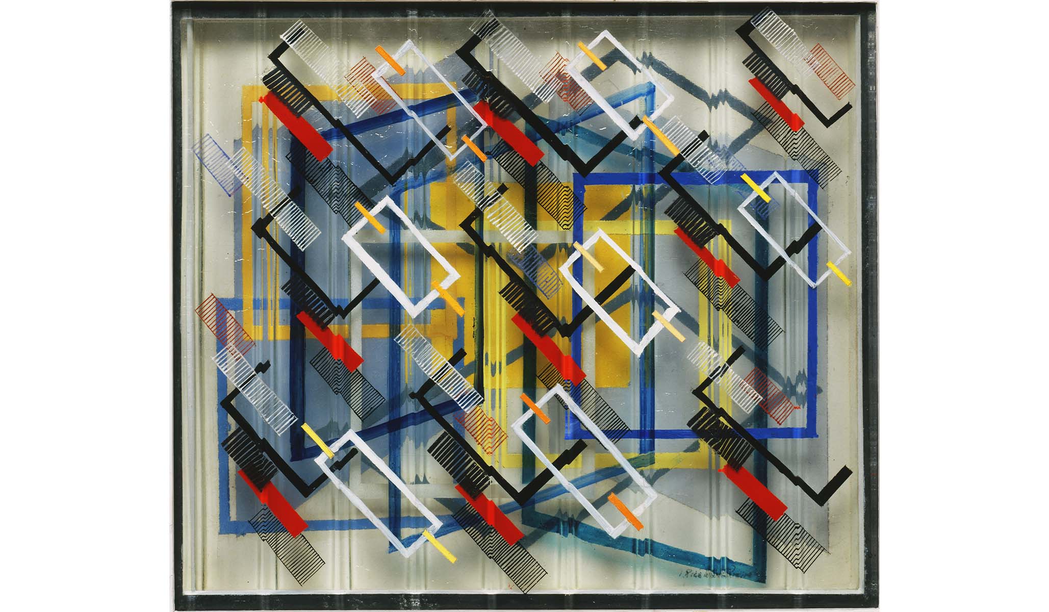
I like ending an exhibition with a blast rather than a whimper. Irene Rice Pereira is a very good artist who uses painted layers of corrugated glass. The effect’s a collision between a carnival funhouse mirror and a Mondrian painting. Her Traversion, from 1946, is riveting but small. It shares a little gallery with the minor Your Hand, from 2020, by Marta Pérez Garcia, and a modello made in 1966 by Barbara Hepworth for a large bronze. Not exactly splashy.
Pour, Tear, Carve is a shoehorn show but also a “something to think about” show, which inexactly tosses ideas and looks into a mix. On that level, it works well enough. I’m always flummoxed when people tell me they don’t like contemporary art. “Then you don’t like life,” I think, since contemporary art deploys materials and concerns that are part of our daily lives in the here and now. Art today, especially in America, is a vast, unregulated affair. There’s no academy. Artists and buyers come from everywhere. There’s no limit on the materials an inventive artist can and will use.
I learned a great deal, especially about the many artists I didn’t know. I think the Phillips should only acquire first-rate art, which doesn’t need to be pricey, and it needs to ditch the PC crap, and that includes PC standards for acquiring art. When I was a museum director, we added lots of work by black, Hispanic, and women artists. The top criterion was quality.

I hadn’t been to the Phillips in a couple of years. One of the great galleries in Washington is its Rothko Room. Duncan Phillips bought four big Rothko paintings in the mid ’50s, deciding in 1960 to display them together in a dedicated room. Their palette is more vibrant compared with Rothko’s late, dark paintings. Rothko believed that his paintings should be grouped in face-offs. He felt two, three, or four would create a visual pulse as the contrasting colors clash. He was right. It’s almost pagan.
I also visited old favorites like Manet’s Spanish Ballet and Delacroix’s little portrait of Paganini. Renoir’s Luncheon of the Boating Party, from around 1881, is peak Impressionism.
It’s sad to see the Phillips’s original house so devalued, and so forlorn. Built in 1897, the brick pile was a house museum when it opened in 1921. Duncan and Margaret Phillips displayed their art in a lovely city mansion setting, mixing El Greco, Goya, Courbet, Manet, Renoir, Eakins, and Ryder with lots of Bonnard, Van Gogh — whom Phillips described as “both Japanese and Gothic” — Braque, O’Keeffe, and Picasso. Luncheon of the Boating Party was displayed there and looked fantastic.
The collectors wanted their art seen in a home setting. Most of it was, at the time, bleeding-edge. Seeing the art in a domestic space would incline visitors to look in comfort rather than fear for their lives.
The museum has had two or three additions since the early ’60s, depending on how we count them. The locus of visitor and curatorial interest has shifted to these new spaces, which are conventional, institutional galleries. In walking around the old house, I felt I was in a space either the day before or the day after a big move, or a store toward the end of a going-out-of-business sale. What a loss.

In one gallery, Eakins’s divine Portrait of Miss Amelia Van Buren, from 1891, a triumph of texture and color, lives with photographs by Bruce Davidson from his East 100th Street series from the late ’60s, Las Gringas, from 2021, by Carol Antezana, Zanele Muholi’s 2020 photographs of black South African women, and a photograph of what my notes call “a very ugly child — Du Bois.” “Du Bois” might be the victim of autocorrect since I can’t locate the work on the Phillips database. No machine, though, would disagree that it’s “a very ugly child.”
They’re not bad photographs, but they pale beside the Eakins, who, by the way, doesn’t look happy. The contrast in scale’s wrong, for starters. Van Buren looks like a cranky spinster, though in reality she was beautiful. On the one hand, she was a frustrated artist. On the other, she looks grand and Victorian. The photographs look puny and whiny compared with her. It all seemed very last-minute, or on-thin-ice curating.
The Music Room, once the star space in the museum, displays some Howard Hodgkin lithographs, which are nice, the truly awful Summer in the Pyrenees, by Chuta Kimura, a minor O’Keeffe, and something by Washington artist Lou Stovall so not-top-tier, so unmemorable that I only wrote, “Stovall — ugh.” What a missed opportunity.
I always enjoy visiting the Phillips, and this was no exception. Jonathan Binstock is the new director. He succeeds Dorothy Kosinski, who was the director for 15 years and whom I admire a great deal. I have known all the Phillips’s directors back to Loc Phillips, Duncan Phillips’s son, but don’t know Binstock, who was the director of the Memorial Art Gallery in Rochester.
I don’t know how much impact he had on Pour, Tear, Carve, since he’s so new, and a newcomer can’t put “not my doing” on labels. I started as director of the Addison Gallery a month before a Terry Winters retrospective opened. The exhibition was wonderful but too big. There wasn’t anything I could do about that, but I did rewrite the labels, which were impenetrable. Some of my new colleagues thought I’d canceled Christmas, but less is more and clarity’s better than muck.