


Authored by Peter Tchir via Academy Securities,
Last weekend we suggested that “I Like My Exceptionalism to Be Exceptional” and highlighted data that was anything but exceptional. As the Citi Economic Surprise Index continues to fall, and CONsumer CONfidence showed anything but confidence, it seemed like a good idea to add to last weekend’s theme.
Let’s start with “full-time” jobs. Full and part-time jobs come from the “Household” part of the NFP data. From my perspective, full-time jobs are more important than part-time jobs. There are certainly other views on the matter, but I prefer full-time jobs.

I find a few things “interesting” on this chart (and by interesting, I mean less than exceptional).
Maybe this is one reason why the “perception” of the economy isn’t as good as the data suggests? Because we pick and choose which data people should pay attention to, that is distorting the reality of the economy most people face.
Now let’s look at the CES Net Birth-Death Model. You know the movie where they say, “you had me at hello?” Well, this “explainer” loses me at about the 2nd line. Maybe I should struggle through more carefully and try to build my own model. Many I am sure have, but I’m not sure if I could, and I definitely don’t care enough to do it. So, with that as a caveat, I often wonder about the impact this has on jobs and how accurate it really is. Maybe it is the awkward name which scares me (seriously, birth-death is the best name someone could come up with for this important component of NFP?).

Since January 2021, the Establishment Survey says we have added 8.5 million jobs, of which 3 million were generated from the birth/death model. Seems reasonable that this “plug” or calculation is about 35%.
In the past year (April 2023 to April 2024), 53% of the jobs created can be attributed to this model. 1.6 million of the 3.1 million jobs created (according to the Establishment Survey). Presumably, this data is correct, yet maybe this explains why there is a difference between the perception of the economy on many fronts, and what Wall Street touts as the “actual” data. Maybe some portion of these “estimated” jobs aren’t really jobs?
I am not sure which data series is “correct“ or which “calculations” we should place more faith in. Yes, according to the BLS, the margin for error is materially higher in the Household Survey than the Establishment Survey, but both are quite high relative to the “precision” with which the data is presented.
I’m not sure in which direction this weekend’s report would have gone had it not been for Friday’s University of Michigan report. Given the ongoing glut of weaker than expected data, and a lot of feedback on last weekend’s piece, I probably would have done the same report. But CONsumer CONfidence solidified the direction we had to go. For those of you who read the T-Report regularly, you know that I am suspicious of the validity of the CONsumer CONfidence survey (hence the double CON). But apparently the devil can quote scripture for his or her own purposes, so why can’t I?
Confidence plunged to 67 from 77 and had one of the biggest misses versus expectations of all time. Current conditions and future conditions didn’t matter – it was bad across the board. Inflation expectations (which the Fed pays attention to) seem to be “less anchored” than they were as the one- year inflation expectation jumped to 3.5% from 3.2% (the highest since November). The 10-year crept back to 3.1%. It had gotten to 3.2% in November, but other than that one print, this is tied as the highest longer-term inflation measure since this whole mess began!
I promised myself I wouldn’t use the word stagflation, since that is nowhere close to my base case, but it is increasingly difficult to dismiss the possibility. So maybe I will just say Stag and Flation and leave it at that as a way to hint that it is creeping into my scenario analysis without quite getting there.
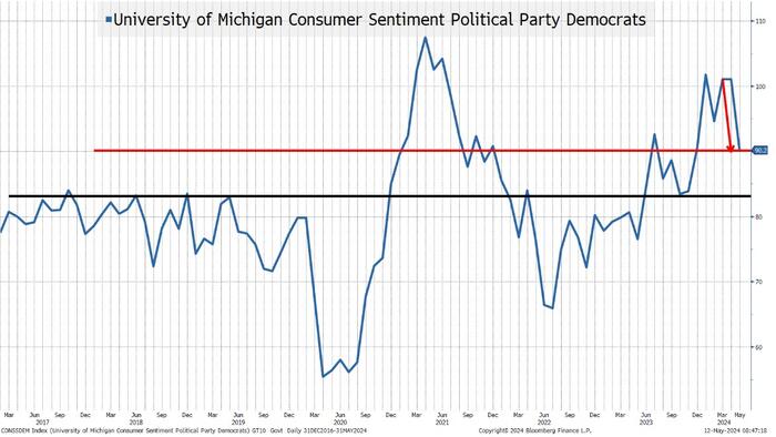
But I digress, the one chart I want to show is the sentiment for Democrats.
University of Michigan provides the data broken down by party affiliation. I have no idea how useful that is in reality, but it is curious. There is almost always a better perception by those whose party is in charge. Any time we dip below the black line on this chart, we should be worried because that is lower than confidence was when Trump was president. We are not there yet, but it has declined to the lowest level in a year. The decline was so rapid that it raised eyebrows. Prior declines could easily be linked to COVID or to the Fed starting to unwind easy money. This one is less easy to pinpoint, especially with the cacophony of “exceptionalism” that I’m taking more notice of than I usually would.
For what it is worth, I believe the University of Michigan itself published something to the effect that they double checked the data and confirmed that it is statistically significant.
Maybe I’m just the devil quoting scripture for my own purposes, but this report (which I often dismiss) is at least somewhat troubling and doesn’t do much for the “exceptionalism.”
We are seeing the price of many commodities increase. I will highlight “Doctor Copper” as it is one of the strongest charts and is normally associated with global economic growth.

IF the rule of thumb holds, then an acceleration of copper should be indicative of increased global activity, which should benefit everyone. Let’s start with what we know:
Copper (along with other raw materials) is rising in price again, potentially sparking another round of inflation fears as commodity price increases are likely to impact either prices or margins – neither particularly appealing for markets. Let’s think about what could be driving this.
Rising commodity prices are unlikely to be helpful from an inflation standpoint. They may be contributing to the inflation expectations in the University of Michigan Survey. What remains to be seen is are they reflective of an improving global landscape, or are they more tied to a theme that is unlikely to benefit domestic companies as much as in the past? It will be very interesting to see how this plays out, and I’m definitely in “trying to figure it out” mode, rather than having high conviction in how it fits my theory.
It looks like we are headed down the path of increasing tariffs. Since 2018, I was largely in support of tariffs, and I probably need to remain supportive. Back in 2018, many argued that the tariffs were going to “Start a Trade War.” My main argument in favor had been that “we’ve been in a trade war for two decades, where only 1 side fired shots.” I did miss how quickly and efficiently China would move into Mexico (as one example) to mitigate the impacts of tariffs.
But since this entire report is a backhanded “compliment” to “exceptionalism” I only want to point out the absurdity of solar panels.
It really hurts my head that over the past few decades (there is no single administration to blame), we have failed to tie together industrial policy, economic policy, and environmental policy.
Not that “free markets” were ever free, but maybe there is a lesson in here somewhere. Though, as much as I’d like that lesson to be that laissez-faire works, I suspect the lesson would be that more control works better, c’est la vie.
In any case, the trade war is ramping up. While the fight is between China and the U.S. (with countries like Germany weighing in), the battleground will likely be in markets across the globe, and I remain afraid that we are far less prepared for that than the market is currently pricing in!
Lower yields. I still like 4.3% to 4.5% on 10s and am pricing in two cuts this year. I am convinced that the economic data will show signs of further weakness. What I am less convinced of, and need to reevaluate, is whether inflation can come down, or whether we’ve bottomed and are heading higher? I don’t like the notion of stagflation as a concept, but it has popped up on my radar screen. So, while I still think yields will drop, I have less conviction. If we get a drop in CPI, which seems plausible, I would probably look to fade any bond market rally on that.
What do lower yields mean for stocks? I think we are near the end of the lower yields/Fed Put rally that has helped stocks creep higher on anemic volumes. Last week we argued that the market might “gap” from “no landing” to some form of “bumpy landing” and I think that is in the midst of occurring, which won’t support risk assets. I still prefer China and think India as an investment will continue to outperform (I think I’ve been more focused on China as it fed my “contrarianism” more than India).
Credit. Boring. Still prefer to reduce exposure to the riskiest credits but think credit will remain “boring” relative to rates or stocks.
Hope you all had a truly exceptional Happy Mother’s Day and enjoyed time with your family!
Now, we can get back to worrying about how “exceptional” or not the economy is!