


Africa is vast.
So vast that its full scale can be hard to grasp by looking at most world maps.
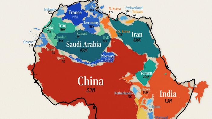
The graphic below, via Visual Capitalist's Pallavi Rao, solves this by combining individual countries inside the continent’s area, showing that Africa’s landmass is on par with the (contiguous) U.S., China, India, and much of Western Europe combined.
Data for this visualization comes from UN Statistics Division and total area (land + inland waters) was used for this comparison.
At 11.7 million mi² (30.4 million km²), Africa is the world’s second-largest continent after Asia.
Put another way, it easily contains the contiguous U.S. (3.1M mi² / 8.1M km²) and China (3.7M mi² / 9.6M km² ) with room to spare.
Add India’s 1.3M mi² (3.3M km²) and we’re still not close to filling the continent’s footprint.
In fact, it takes a total of 30 countries together—shown in the graphic above —to equal Africa’s total area, underscoring how massive the continent is in absolute terms.
Of course, country selection can change these numbers. If prioritizing Central and South American countries instead (like Mexico and Argentina,) the comparison could reduce to 18 entities.
Including Alaska and Hawaii would increase America’s footprint by 700,000 mi² (1.8M km²).
Many of us grew up looking at wall maps that use the Mercator projection.
This 16th-century design keeps straight lines for navigation but dramatically enlarges regions near the poles and compresses those near the equator.
Africa, which straddles the equator, is one of the biggest victims of this distortion.
That discrepancy fuels common misconceptions about just how expansive Africa really is.
The African Union has asked international organizations to stop using the Mercator projection.
They say this size misrepresentation undermines the perceived global influence and importance of Africa and perpetuates stereotypes.
For example, the frequent use of the Mercator map in educational settings and media can lead many to unconsciously imagine Europe and North America as disproportionately significant.
Meanwhile Africa appears less substantial and “marginal.”
The map above also drives home another point. When discussing global development, trade, or climate impacts, treating Africa as a single bloc overlooks the continent’s enormous spatial and cultural complexity.
If you enjoyed today’s post, check out Germany’s Economy Compared to 22 European Countries on Voronoi, the new app from Visual Capitalist.