


By Peter Tchir of Academy Securities
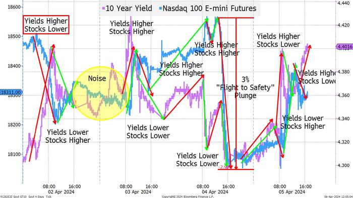
In one way, the week was quite simple. The S&P and Nasdaq dropped around 1% while 10-year yields popped 20 bps. Rate cut projections were slightly reduced and the likely start time was pushed back a touch. All seemingly “normal.” Then why the heck did we get a chart like this?
I’ve produced some ugly charts in the past, but this is in the running for the worst of all time. I thought about trying to fix it up, but then figured, after a week like this, why not go for the full Rorschach test?
There are three things that I see in this chart (I am a little bit scared about what a psychologist would make of my interpretation, but here goes):
That is what I get out of that messy chart!
I learned a few things:
I am still nervous about equity risk, and still doubt that we will get any overall rotation (Russell did far worse than the S&P 500 this week). Energy is my favorite sector as I think that there are many tailwinds, plus you get the geopolitical tail risk for “almost” free (since I don’t think much is being priced in yet).
I think that the 10-year is now moving into the 4.4% to 4.6% range. Maybe higher as the bulk of the move to this level has been due to diminished rate cut expectations, rather than an increase in risk premium. That should be coming, and I would like to see 2s vs 10s back to -20 or even closer to 0 than that.
Credit will likely remain dull. No obvious catalysts for a big widening in spreads, but it is also difficult to see a reason for anything more than a small pullback in spreads. I do owe readers a “rotation” report on private credit, which got delayed with the craziness of this week.
As Seargent Esterhaus liked to say, “let’s be careful out there” as the risks are mounting, and we’ve shown how susceptible we can be to them. On that note, please see the link to register for our Academy Securities Geopolitical and Macro Strategy Webinar on Tuesday April 9th at 1pm ET.