


Lyle's Golden Syrup has come under fire after changing their iconic logo on their packaging.
The company, which was founded in 1881 by Abram Lyle and has remained Britain's leading golden syrup brand.
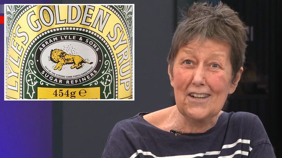
Featured on the packaging, taking inspiration from the Bible's Lion and the Bees story, has always depicted a dead lion, with a swarm of bees around hit.
However, customers have only recently noticed the image and branded the logo "disturbing", calling for a change to the packaging.
Lyle's Golden Syrup has removed their iconic lion logo from their packaging
Lyle's Golden Syrup / GB News
Executive Director of the Royal Fine Art Commission Trust, Robert Bargery, said: "A successful brand with a solid reputation probably has more to lose than gain by going for a new logo.
"The redrawn lion is so stylised as to lack clarity at first glance, whereas the old lion is clearly a lion: it is what it looks like on the tin."
Discussing the brand's axing of the logo on GB News, host Eamonn Holmes admitted he'd "never noticed" the depiction of the dead lion on the packaging.
Cohost Isabel Webster was in agreement, admitting: "I knew there was a lion on it, but never noticed what was all over it."
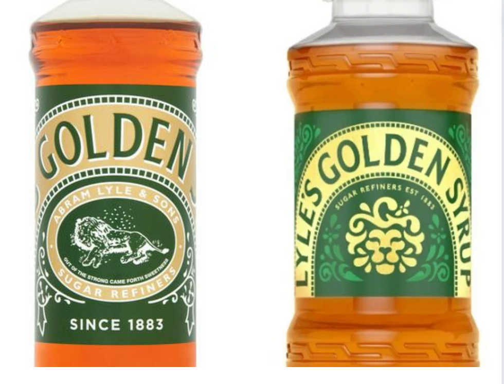
Lyle's Golden Syrup logo has been replaced on plastic squeezy bottles
Lyle's Golden Syrup
Commentator Fraser Myers revealed the meaning behind the logo and its biblical meaning, stating it comes from "the Samson and Delilah story from Bible" and cited the quote "out of the strong came forth the sweetness" on the original packaging.
Myers admitted the original logo was "a little bit grim", but said it was a "shame" of the iconic logo to be changed so suddenly to a "cute lion" after facing backlash.
Myers added: "It looks like it could be any other company now."
Eamonn replied: "But it's so tiny, so minuscule, you wouldn't notice it."
Commentator Scarlett MccGwire was outraged by the decision, fuming: "But why change it? There's nothing wrong with it.
"It's been like that for decades and no one will notice if they change it anyway. It's just silly."

Panellist Fraser Myers says the original logo was 'a little bit grim'
GB News
Taking to Reddit, social media users expressed their fury towards the changing logo.
One user wrote: "Lyle's packaging is possibly the world's oldest in continuous use, having not changed significantly since 1885, so it would be a shame if they altered it."
Another user admitted to not noticing the original logo on the packaging, raging: "There's a dead f***ing lion on the front of golden syrup? How have I not noticed this in 33 years?"
A third Reddit user called for the original logo to be reinstated, writing: "Always wondered why they had a dead Lion with bees buzzing around it as a logo.
"Definitely need to bring it back. This new face looks like the Cowardly Lion from the Wizard of Oz who got his courage and a new doo."