


Cracker Barrel is under fire.
What did they do? They changed their logo.
I thought their logo used to be charming. It showed a middle-aged white farmer sitting on a chair, leaning against a barrel with a logo that said “Cracker Barrel: Old Country Store.”
It didn’t look generic. Their new logo now shows the same font and letters, but they got rid of the man on the chair leaning on the barrel and the old country store. All that’s left is just the Cracker Barrel logo inside a yellow hexagonal background.
It looks like you’re driving into a Carl’s Jr.
I would hazard a guess that the shape is supposed to be in the shape of a sideways barrel, but you have to really think about it to get that far.

Courtesy: Cracker Barrel
It’s a very bad move.
It’s getting rid of historic intellectual property in favor of something absolutely and ridiculously generic.
When it first opened in 1969, Cracker Barrel had a logo with just text. In 1977, it updated its logo to have the man resting next to the barrel. The restaurant says the new logo is now rooted even more closely to the iconic barrel, shape, and wordmark that started it all. It also noted that farm-fresh scrambled eggs and buttermilk biscuits were the inspiration behind the color palette in the new campaign.
WATCH: The Ben Shapiro Show
Cracker Barrel CEO Julie Felss Masino tried to explain why they mutilated the logo this way, saying, “Honestly, the feedback’s been overwhelmingly positive that people like what we’re doing. I’ll give you another sound bite. I actually happened to be in Orlando last week with all of our managers. We bring them together once every other year and the number one question that I got asked was, ‘How can I get a remodel? When can I get a remodel? How do I get on the list?” Because the feedback and the buzz is so good, not only from our customers, but from our team members. They want to work in a wonderful restaurant. So we’re doing everything for our guests and our team members.”
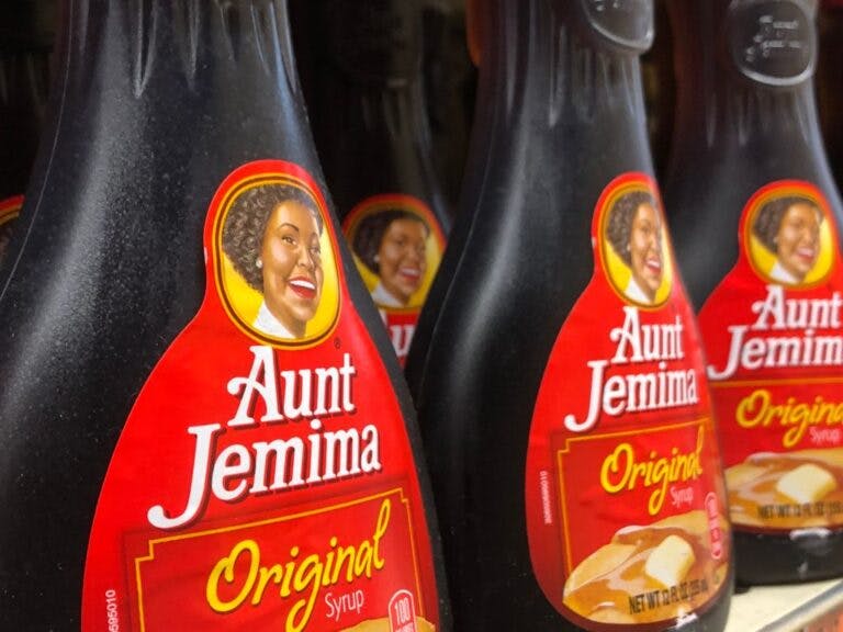
This is very reminiscent of when we used to buy Aunt Jemima’s syrup. During the great racial reckoning of 2020, they decided they had to redo the entire logo and they changed it to Pearl Milling Company. That was bizarre, because the actual story of the woman who was Aunt Jemima is fascinating.
Benno Schwinghammer/picture alliance via Getty Images
Her name was Nancy Green, and according to ABC News, “Green was born into slavery in Montgomery County, Kentucky. After the Civil War, she moved to a deeply divided Chicago, becoming a strong voice at Olivet Baptist Church, the city’s oldest black congregation.”
ABC News found a descendant of hers who said, “She was the trusted face. Back then, you know, anybody who would look at an African American woman cooking, they knew that they can trust her cooking, that she could cook.” He said of the decision to remove her picture, “I was taken aback. I was really shocked. I knew people didn’t realize that those were real people and, you know, to phase them out would kind of erase their history.”
But somehow this was supposed to make the country better.
I’m not sure what Cracker Barrel is doing here. It doesn’t make a lot of sense. Cracker Barrel does have many DEI initiatives. If you take a look at their corporate website, they have the LGBTQ+- sign; they have a diversity, equity, inclusion, and belonging department.
In other words, they do all of the usual left-wing tropes. They’re a generic New York-based kind of company.
I would have guessed that when they lost that local flavor, they would lose some sales as well.
Sure enough, on Thursday, CBS News reported, “Cracker Barrel shed almost $200 million in market value after its stock plunged Thursday following the release of a new logo. … Shares of Cracker Barrel fell as much as $8.74, or almost 15%, in Thursday trading, shaving as much as $194.6 million from the company’s market value. The stock regained some ground in early afternoon trading, with shares down $8.19, or 13.9%, to $50.84.”
It is sad that so much of the intellectual property of America is getting more and more generic. I remember when McDonald’s had the big golden arches outside, and now they’ve decided to dump them in many places and instead use a generic logo.
It’s making the culture deeply impersonal and cold.
And I don’t like it.

Continue reading this exclusive article and join the conversation, plus watch free videos on DW+
Already a member?